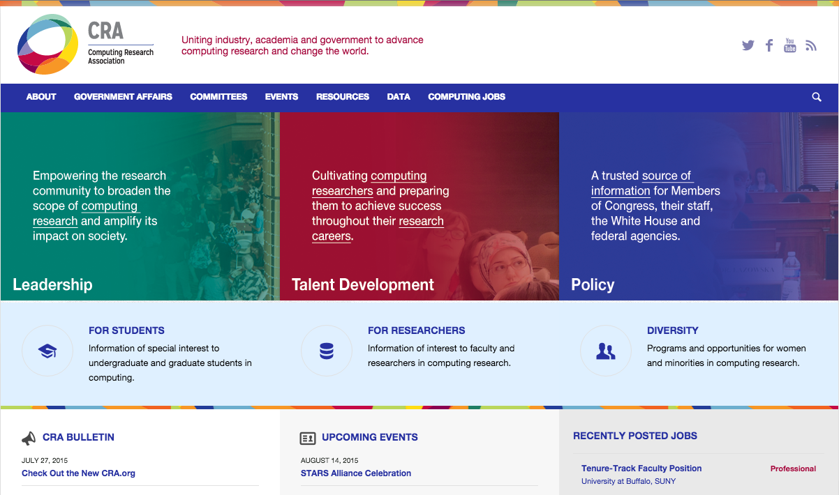
CRA Introduces Revamped Website: Check Out the New CRA.org
If you have visited the CRA website lately, you may have noticed that it’s been refreshed with a new look and feel. The new website presents a more consistent visual identity for CRA and provides a seamless experience for a visitor viewing each of the committee sites, in addition to CRA.

The previous website was designed in 2008, and since then additional Web 2.0 features have appeared. Our new website has been designed with cutting-edge features and functionality, while engaging users with pertinent and timely information. The new site structure gives users easier access to information, and our news blog, the CRA Bulletin, is one of the new resources available on the site. The site was built with a responsive design approach, so it will be easy to view on a multitude of devices. During the next few months, we’ll be revealing more new features and content, so visit often!
New features include:
- Responsive design for mobile devices and tablets
- Consistent look and feel, as well as information architecture for committee sites
- Additional search features for the computing jobs section
- Improved Computing Research News interface
- A new blog, the CRA Bulletin is introduced. Click here to subscribe.
We hope you enjoy our refreshed look and new features. We are excited to share this news with you, and thank you for your interest and participation in CRA.


