A Comparison of East Asian, South Asian, Southeast Asian, and White Undergraduate Student Familial Support
A Comparison of East Asian, South Asian, Southeast Asian, and White Undergraduate Student Familial Support

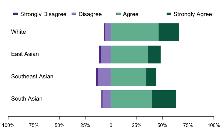
Education research focusing on diversity in computing in the United States often considers Asian/Asian American students and White students to be “advantaged” demographic groups. However, Data Buddies survey data collected during the fall of 2015 indicate Asian/Asian American versus White students’ experiences pursuing computing degrees may differ. For instance, CERP examined undergraduate students’ family support for pursuing a computing degree. Whereas South Asian students’ level of family support was statistically equivalent to that of White students, East Asian and Southeast Asian students’ family support was significantly lower than that of their White peers, p ≤ .05. These findings suggest Asian/Asian American and White students may overlap in some experiences in computing, but this overlap may depend on students’ cultural identities within their Asian/Asian American identities.
Notes. For this analysis, only students who reported a single race/ethnicity among the following were included: White, East Asian, South East Asian, or South Asian. There were n = 6,223 such students (65% of the full undergraduate dataset of n = 9721). The racial/ethnic breakdown was: 4,228 White: (68%), 1,070 East Asian (e.g., Chinese, Japanese, Korean, Taiwanese: 17%), 359 Southeast Asian (e.g., Cambodian, Vietnamese, Hmong, Filipino: 6%), 566 South Asian (e.g., Indian, Pakistani, Nepalese, Sri Lankan: 9%). The following four items were used to calculate a measure of family support: My family encourages me to pursue a computing degree; My family questions why I would pursue a computing degree (reverse scored); My family wonders why I invest so much time and effort into studying computing (reverse scored); My family emphasizes the value of earning a computing degree, Cronbach’s alpha =.76. Bars in the graphic above represent the percentage of students in a given race/ethnicity category who responded in each level of a 5-point Likert scale, (1) strongly disagree, (2) disagree, (3) neither agree nor disagree, (4) agree, (5) strongly agree. Students who responded “neither agree nor disagree” were not included in the graphic but were included while calculating the percentages.The differences illustrated in the graph were tested using an Analysis of Variance, and follow up Dunnett’s tests comparing each Asian/Asian American group to White students. Analyses used an alpha level of p ≤ .05 to determine statistical significance.
 This info-graphic is brought to you by the CRA’s Center for Evaluating the Research Pipeline (CERP). CERP provides social science research and comparative evaluation for the computing community. To learn more about CERP, visit our website at https://cra.org/cerp/.
This material is based upon work supported by the National Science Foundation under Grant Number (CNS-1246649; and/ or DUE-1431112). Any opinions, findings, and conclusions or recommendations expressed in this material are those of the author(s) and do not necessarily reflect the views of the National Science Foundation.


